In our studio today we had a workshop to help us with our article layout and InDesign skills. This task was quite helpful in terms of being able to identify where grids have been used in magazine layouts and learning how to use them in our articles but since I have almost no experience with InDesign I found this task to be a bit hard.
The first thing we did was to find some articles and double page spreads that have an interesting layout. We then used tracing paper to mark out where the grids have been and also made a log of the measurements and of what content in contained in the space.
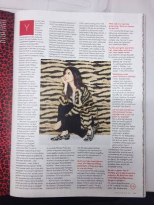
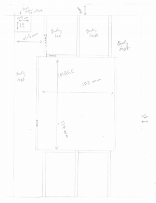
Here is the first article I looked at I liked this one just cause of the image in the middle and the use and the multiple columns used. Next to it you can see how I marked out the grid and measurements.
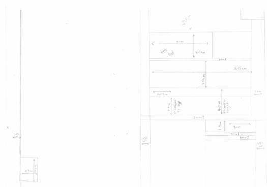
I also had a look at a double page spread that I thought was interesting and used the same method to draw up the measurements.

After we had finished marking out the measurements we then went onto InDesign and tried to create a document that resembles our chosen layouts as closely as possible. This was the part of the workshop I struggled with most but I think it resembles the first article reasonably well.
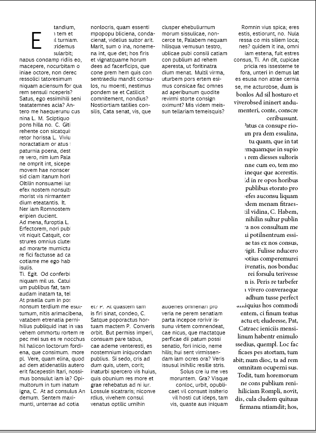
One of the first problems I can see with the document I have made it that the type is being overlapped by the white box (representing the image) when the type in the original works around the image and the same again with the starting letter. I think this could be due to putting the type in first and then creating the boxes over it if I was to do this again I think i’d put images in first and that way InDesign should know to work the text around it.

Nice read Cameron! Keep it up. You’re building an array of good content.
LikeLike